PYREX Colors | Sub-Brand Architecture
Sub-brand identity and packaging system architecture for a new colored glassware collection.
The Challenge
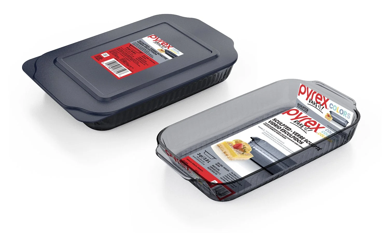
Pyrex needed a premium packaging identity for their new coloured glass line without diluting their iconic heritage equity. Their legacy, heavy-red packaging obscured the subtle glass tones and looked dated on shelf. Operationally, the packaging system had to accommodate trilingual copy across variable format dimensions.
The Solution
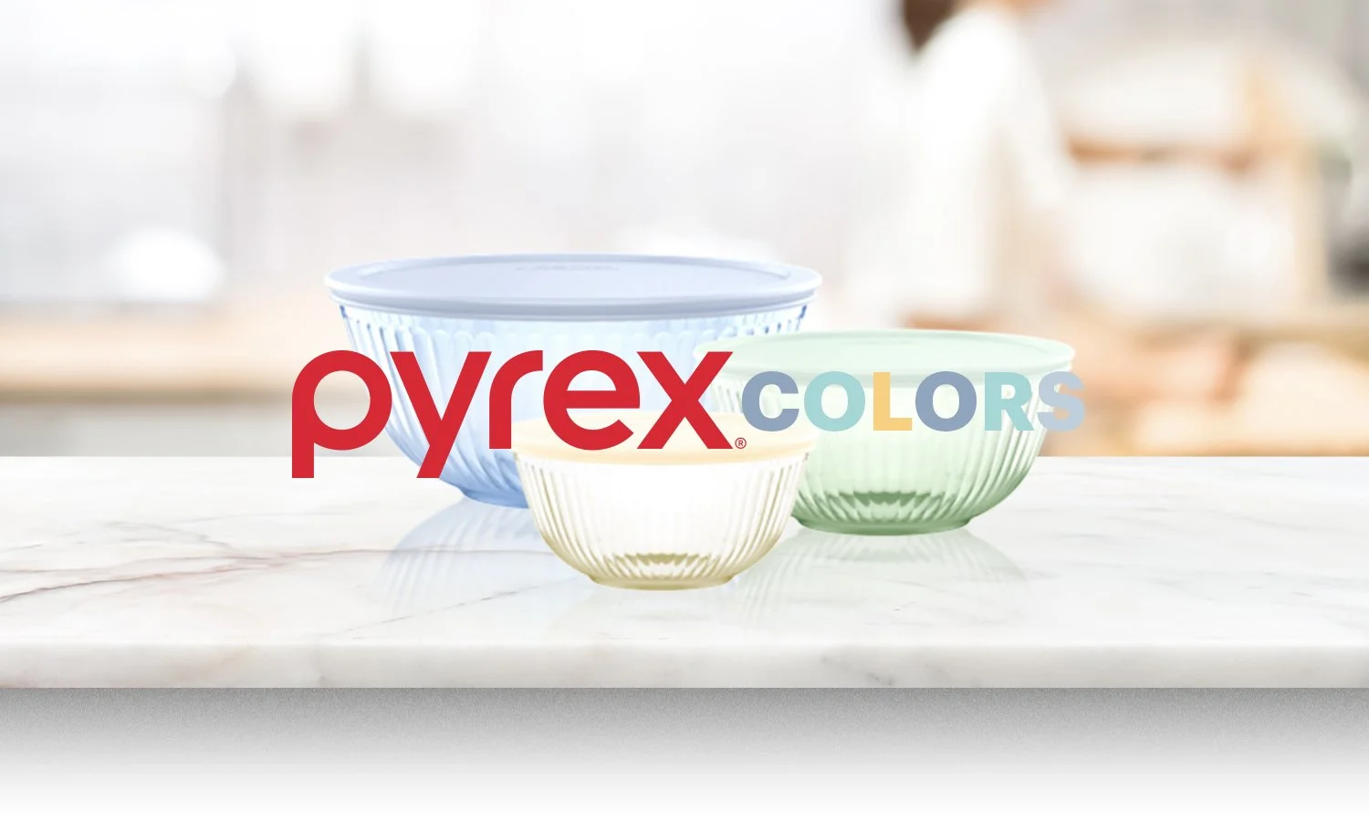
Sub-Brand Identity: Created the new “Colors” sub-brand identity and structured visual hierarchy.
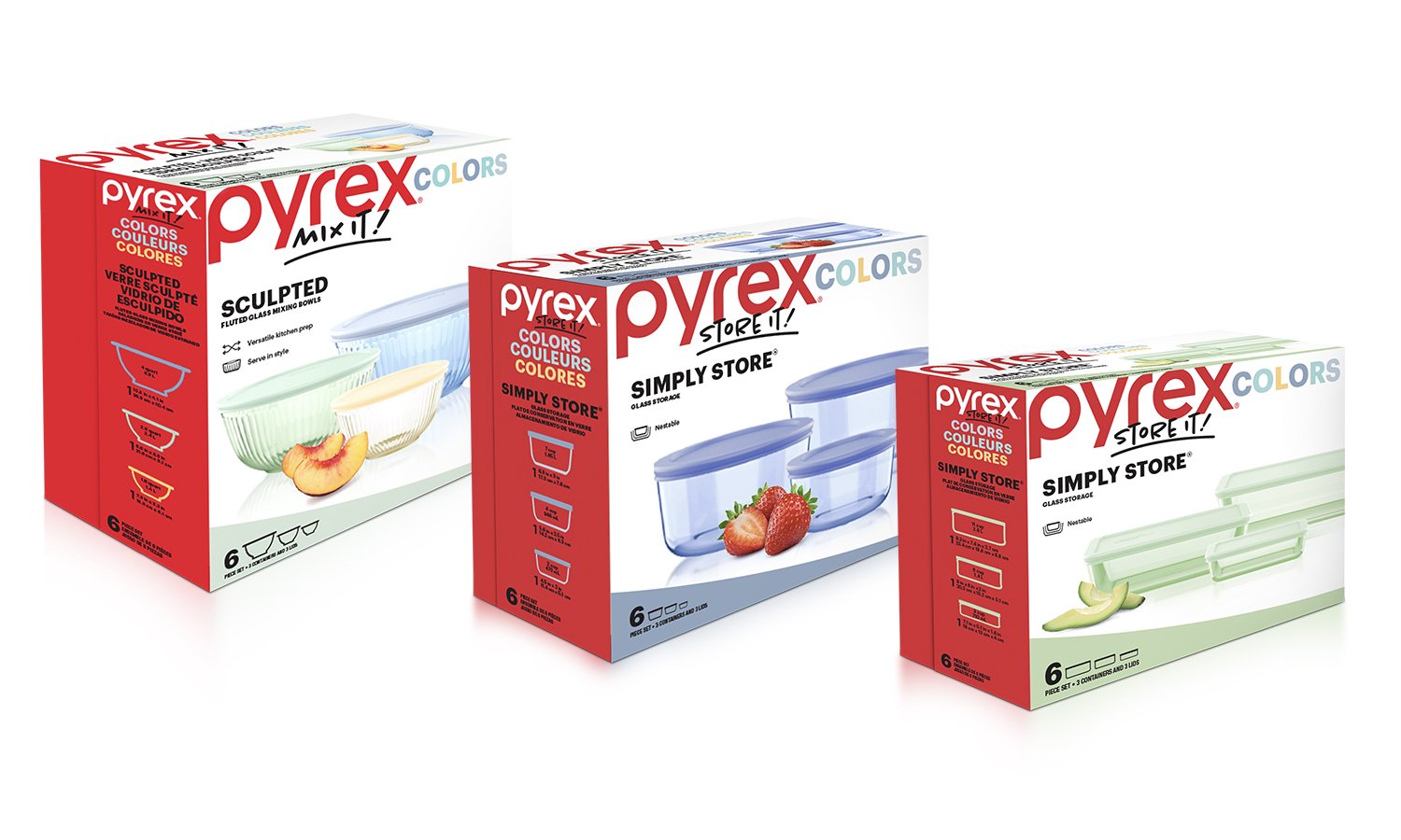
Shopper Contrast: Shifted to a clean, crisp white background so the product leads visual interest on shelf.
Brand Anchor: Retained the iconic red Pyrex logo and anchored each box with signature red end-panels for immediate brand recognition.
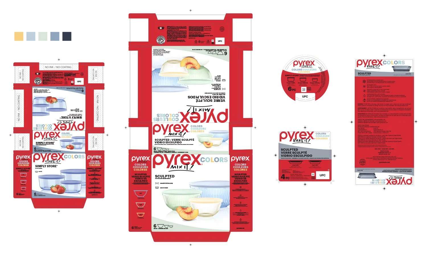
SKU Scalability: Built modular layout rules to easily fit trilingual copy and regulatory requirements across every box format.
The Result
3+ Years Unchanged: A clean, high-end packaging system that has remained unchanged on national retail shelves for over 3 years, eliminating costly re-staging and redesign cycles.
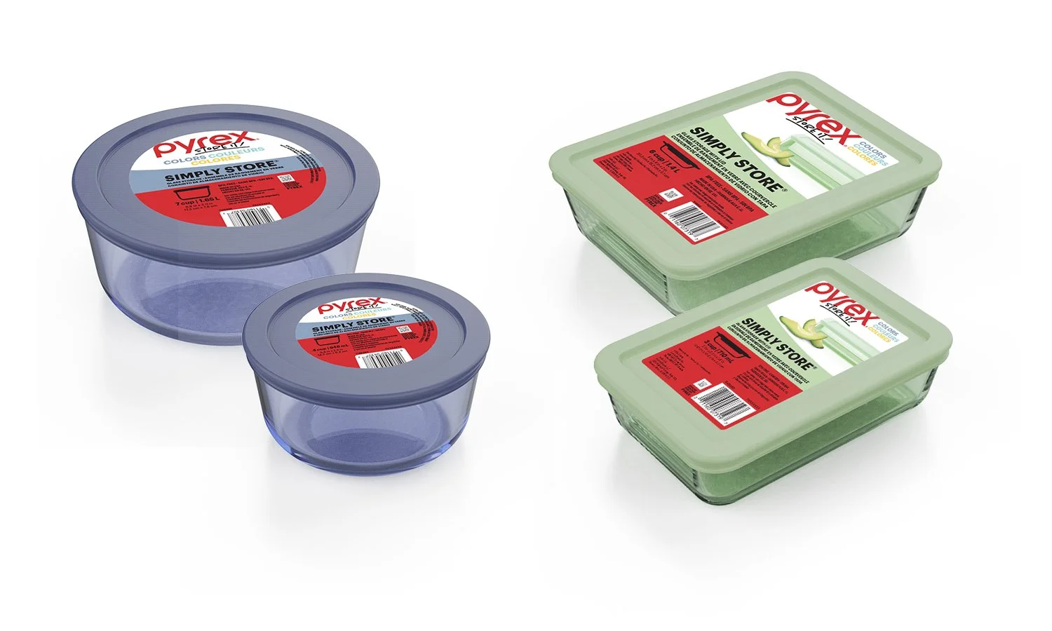
Seamless Rollout: Executed across litho boxes, top stickers, and variable package sizes without losing master brand equity or diluting shelf presence.