PJ’s Craft Cream Liquor | Packaging System
Creative direction and design for a small-batch Ontario cream liquor.
The Challenge
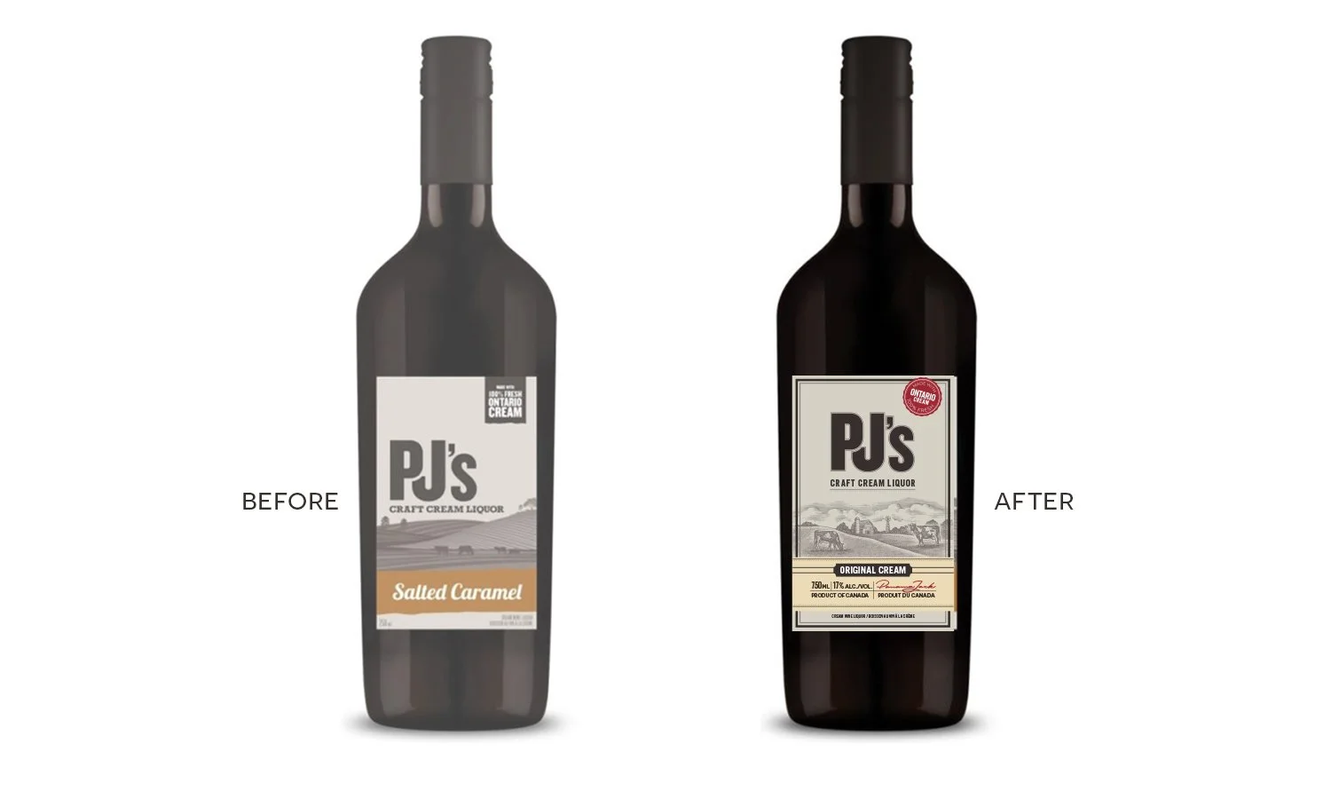
PJ’s Craft Cream Liquor had established local recognition, but its generic label vanished on crowded retail shelves. With zero budget for custom glass molds or expensive structural finishes, front-of-pack strategy alone had to carry the weight of making the product look authentic, premium, and craft-made while preserving existing customer recognition.
The Solution
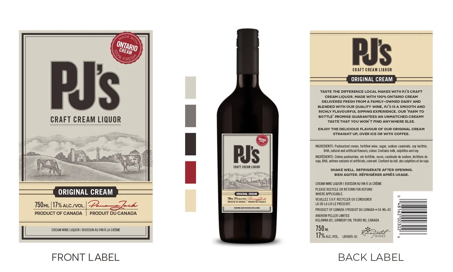
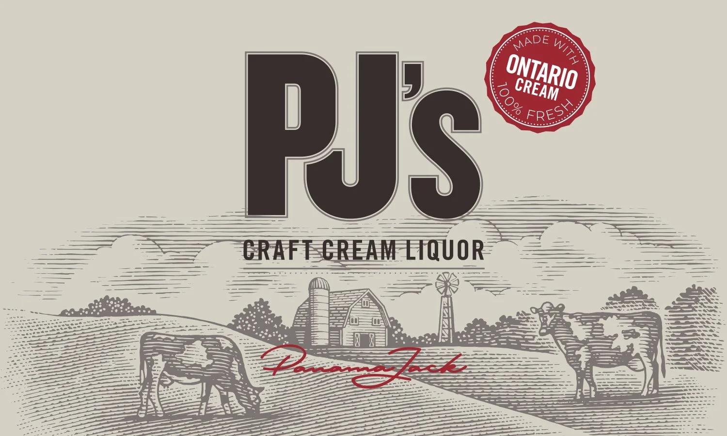
Art Direction & Licensing: Directed the selection and licensing of custom artwork by renowned illustrator Steven Noble, instantly injecting heritage and craft authority into the brand.
Messaging Hierarchy: Sharpened colour contrast and restructured front-of-pack copy so the bottle cuts through category noise on store shelves.
Local Positioning: Elevated “Ontario Cream” from an obscure footnote into a prominent, high-margin mark of quality.
The Result
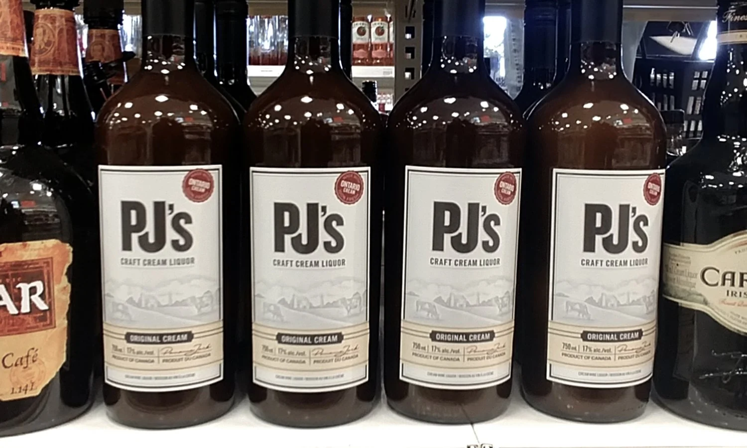
8+ Years on Shelf: The core packaging system has driven in-market sales for over 8 years without requiring a single strategic refresh.
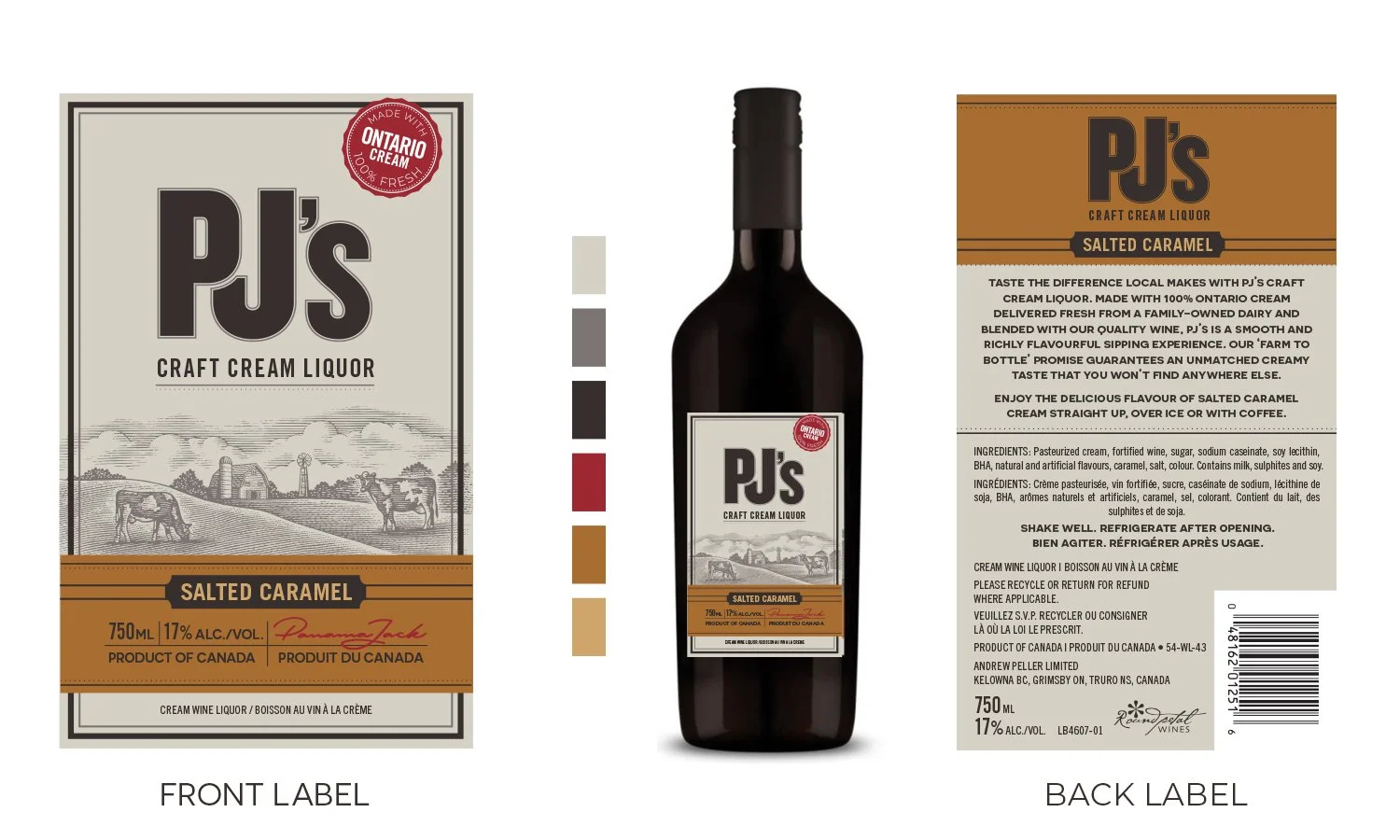
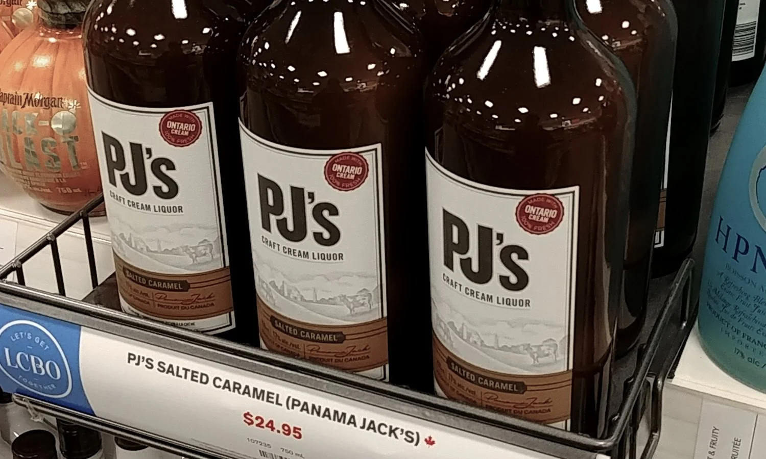
Retail Expansion: Secured and held prime LCBO shelf placement while seamlessly expanding into multiple new flavour SKUs on the original architecture.
Industry Recognition: Debuted at the 2018 Finger Lakes International Wine Competition, where the new packaging system helped earn the brand a Double Gold Medal.